|
|
Post by hoophead on Sept 11, 2007 14:45:27 GMT -5
Since only 5 people remain from the banner, is there any way that someone could put a new one together that actually has people on the 2007-08 Nuggets on it instead of the team from 2 years ago?
Thanks much.
|
|
|
|
Post by Camby's Left Nut on Sept 11, 2007 14:57:40 GMT -5
Definitely not.
|
|
Deleted
Deleted Member
Posts: 0
|
Post by Deleted on Sept 11, 2007 15:10:00 GMT -5
wont happen.
|
|
|
|
Post by ReDunkulous on Sept 11, 2007 18:04:56 GMT -5
don't hold your breath.
|
|
|
|
Post by cambrad on Sept 11, 2007 18:08:10 GMT -5
I love it how the guy with 31 posts has to bring it up.
GET WITH IT CARA!
|
|
|
|
Post by hoophead on Sept 11, 2007 22:08:42 GMT -5
I have way more than 31 posts....multiple handles. Been on here for quite some time.
We should put Skita and maybe Priest Lauderdale up there if we are going to have ex-Nuggs on the banner. At lease then people would get a chuckle out of it.
|
|
|
|
Post by amazing grace & Chuck on Sept 11, 2007 22:43:56 GMT -5
How about a famous white bench players banner?
Scott Hastings, Mark Pope, Bill Hanzlik, Chris Herron, Skita, Kleiza
|
|
|
|
Post by keke on Sept 11, 2007 23:00:29 GMT -5
YES!! It's new banner time!!! Do it now!  |
|
|
|
Post by rock on Sept 13, 2007 10:53:26 GMT -5
if cara creates a new one, ill put it up.
|
|
|
|
Post by cambrad on Sept 13, 2007 17:49:42 GMT -5
If fabs needs pictures, like last time, I gotz him covered.
|
|
|
|
Post by corona on Sept 16, 2007 20:21:57 GMT -5
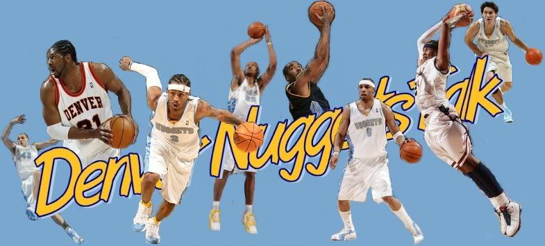
rough draft....  if anyone wants i can host the .psp file and you can clean up the edges for me (they're a little rough in spots). i think the basic idea is right though....same as before, same sort of font. just different pictures. |
|
|
|
Post by cambrad on Sept 16, 2007 21:17:58 GMT -5
Too much JR and Kenyon.
|
|
|
|
Post by Camby's Left Nut on Sept 16, 2007 21:20:40 GMT -5
Wheres Wafey?
|
|
|
|
Post by cambrad on Sept 16, 2007 21:20:44 GMT -5
And that's team USA melo.
|
|
|
|
Post by truch on Sept 17, 2007 1:44:47 GMT -5
Where's teh Yak???
I think the font should stay the same as it is with the old banner.
But A+ for effort, I wouldnt spend the time doing it.
|
|
|
|
Post by Camby's Left Nut on Sept 17, 2007 1:59:18 GMT -5
I agree about the text. I like the Iverson and Nenê pics.....but the rest not so much. They're either too small or not very good quality(and as you said, the cuts on some of them arent very good).
Pretty good overall though......at least you gave an effort, unlike Cara's lazy ass.
|
|
|
|
Post by LotharBraunBrownBryant on Sept 17, 2007 13:05:01 GMT -5
The banner is a little bit sparse -- there's a lot of empty space on it. The font is a bit thinner than the previous font, and the pictures are more spread out in comparison. Some of the pics are really small.
It'd look awesome if the smaller pics were slightly enlarged, the last few team members were added, and maybe if fewer letters were blocked by Kenyon/AI/Melo.
Oh, and a pic of GK in his pimpin' throwback would be awesome. Even if you hate him as a coach... the throwback was awesome.
|
|
|
|
Post by corona on Sept 17, 2007 16:13:06 GMT -5
anyone know the best way to clean up the edges with 'paint shop pro 7'  maybe just go around all the edges with a semi-transparent black brush? i think that's the biggest issue with it. makes it look quite sloppy. (that, and i saved it as a .jpg) it's difficult to find full body images. and for a banner like this, that's what's needed. (because there's no border) so it makes the picture selection quite sparse. particularly in the middle of the summer when the pictures on yahoo/espn aren't available anymore. if you find me a full body image of karl in the throwback i'll put it in there. i don't really want to put chucky atkins in a memphis/lakers/detroit jersey on our banner. or von wafer in a lakers/14ers jersey. too strange. |
|
|
|
Post by amazing grace & Chuck on Sept 17, 2007 16:29:29 GMT -5
|
|
|
|
Post by cambrad on Sept 17, 2007 17:01:47 GMT -5
Our banner should just have our most popular players. Chucky and Wafer can wait for now.
|
|